Most current enterprise software treats AI as a feature you can point to. A chat panel. A suggestion tooltip. Something bolted on. It doesn't really change how the product feels to use, it just adds to it.
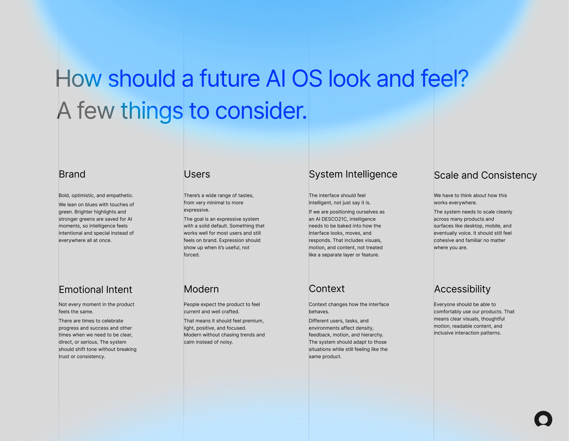
With agentic AI and more powerful LLMs becoming the new reality, I wanted to dig into a harder question: what does a product actually look like when intelligence is baked into the experience instead of layered on top of it? The answer isn't just smarter UI. It's interfaces that tell a story, that feel alive and responsive, not static.
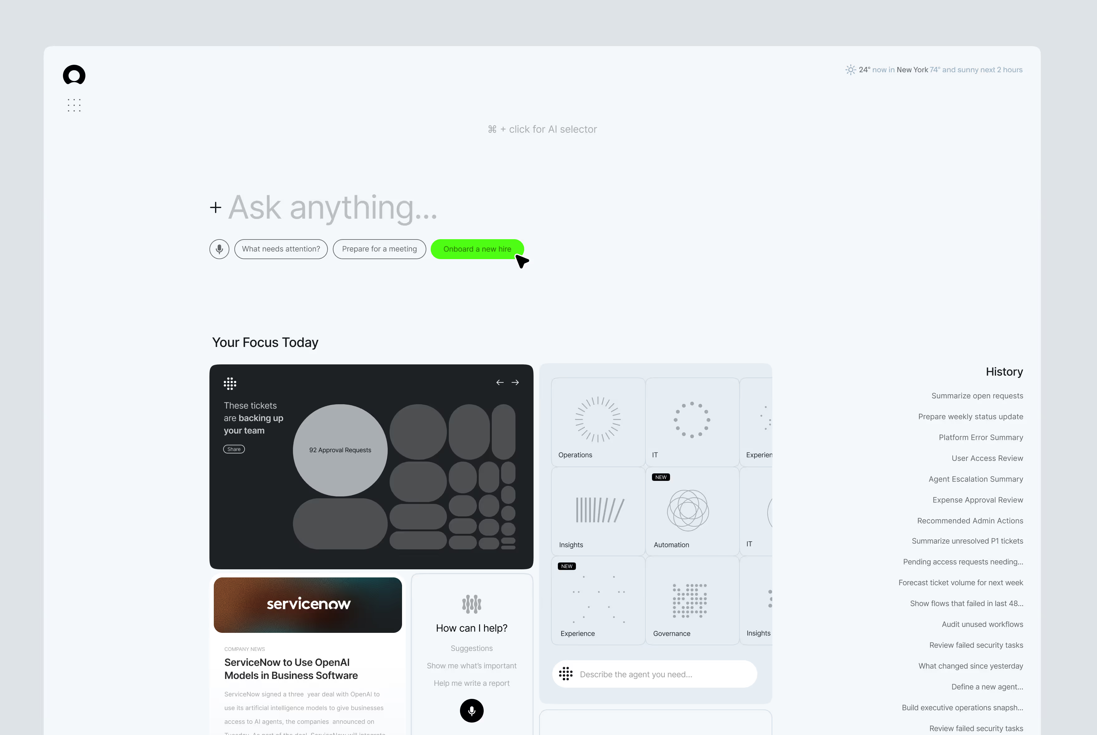
These are two visual explorations of that within a future state at ServiceNow. The goal wasn't to redesign everything. It was to work through something more specific - how do you make an interface, specifically a home page dashboard, feel intelligent?
Visual Systems
UI Design
Motion
These concepts can be broken down into two themes. The first feels light, positive and airy. It attempts to answer the question of how a premium future Servicenow product would feel according to some of our Horizon Design System language.
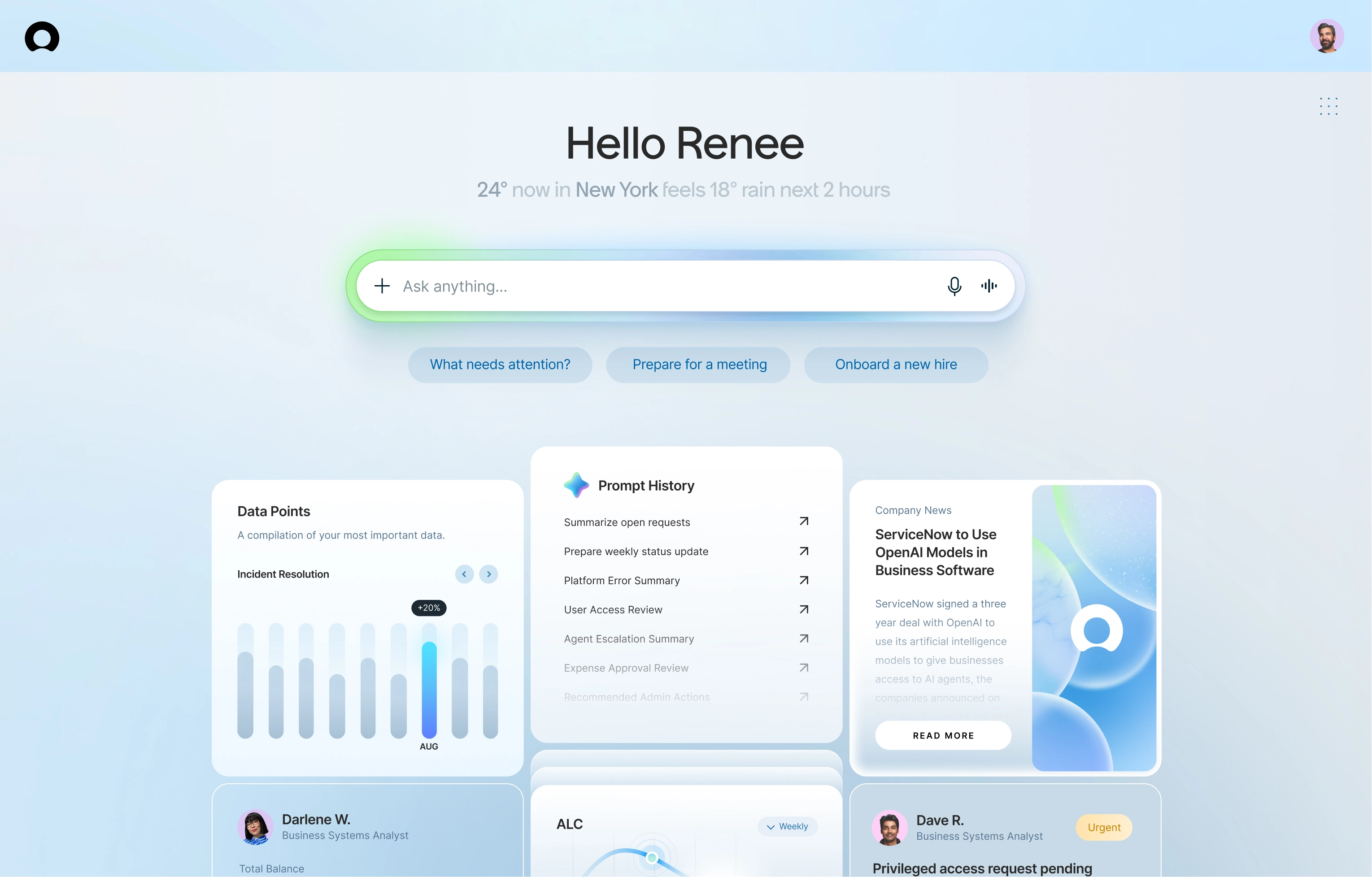
The color on the central "Ask anything..." AI input of the page is meant to show on load and hover. The flash of green draws a user's eyes to a powerful input that feels and acts intelligent.


Different variations of warmer and cooler color palettes were explored. When using green as our AI brand color, purples risk clashing, and green backgrounds can overshadow what should feel like the most powerful part of the experience.
Using the ServiceNow Youmoji as a loader reinforces brand presence within the most powerful part of the experience. Rather than simply shifting colors on the Youmoji itself, it transforms into a fluid circle with an AI color palette moving across it, creating a distinct AI brand moment that doesn't muddy the ServiceNow Youmoji branded image.

Exploring hover states with AI features specific to every card.
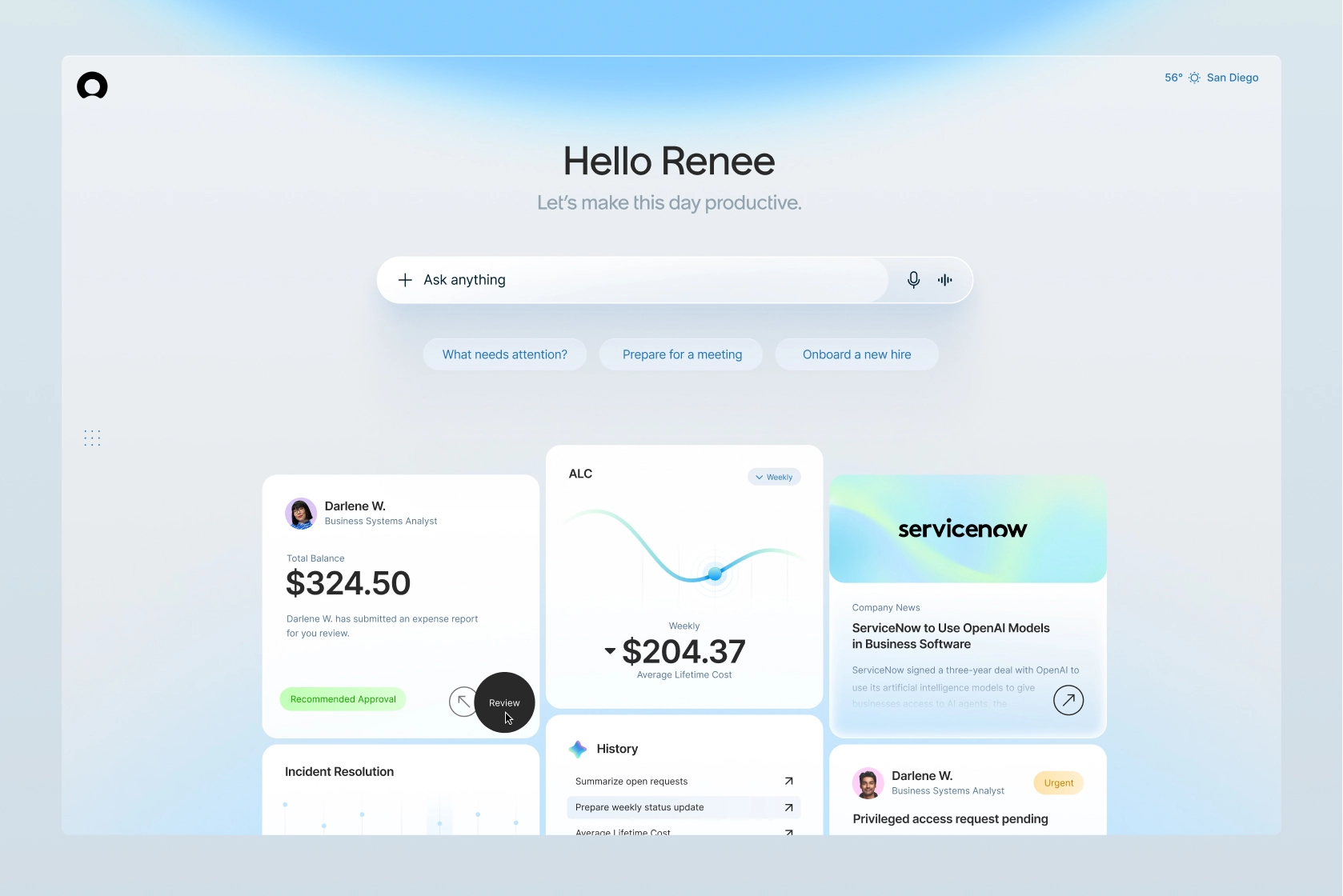
A couple other similar treatments exploring a range of expression. Servicenow has many users with some perhaps favoring more expression as they customize their AI OS interface.
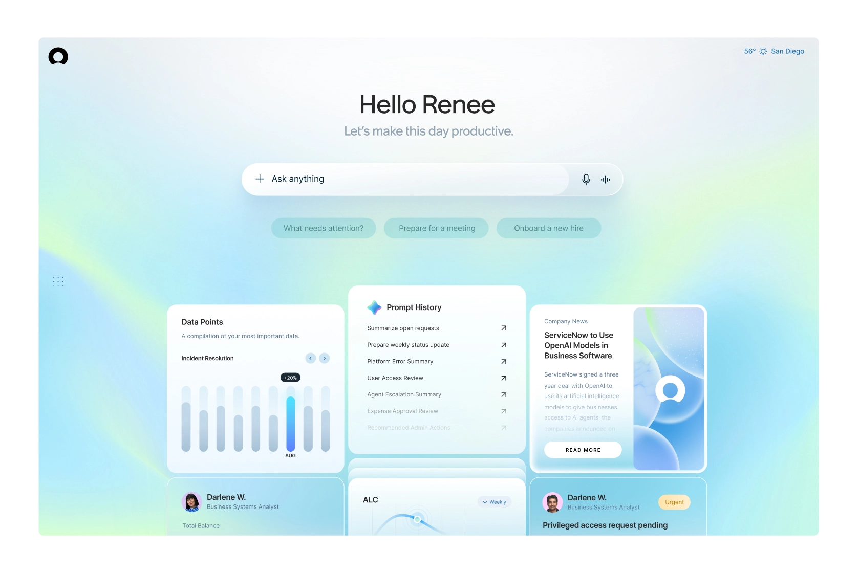
The second group of concepts focused on minimalism. What would an interface look like stripped down to only what is needed at every moment? Both approaches use the same strategy of deploying color only when necessary, but this version takes it further.
Soft greys with electric green highlights and hover states keep the experience intentional and focused. Baked-in features like hotkeying and selecting specific parts of the page for AI context make the interface feel responsive without adding visual noise.
Illustrations and iconography have been reduced to lines and dots, reinforcing the principle of showing only what matters, and letting color reinforce when AI features reveal themselves.

A look at different considered states of how an AI input might behave, with the compact state even being draggable and pinnable within the experience.
A quick motion study of how a hotkey and then drag and select interaction could add context to your AI menu.

All Works ©2K26 Ryan Blackman

